One of the most appealing features of our removable wallpaper is the customisation option. This time I am going to go through color adjusting in particular.
I trust all of us have been in a situation where we would like this or other product, if only it would be different shade or just that one color could be changed in the design. We have this option for most of our designs. Customisation possibility is usually indicated by added color palettes to the listing. However, I can tell you a secret, almost all of our wallpaper designs are customisable. Even if it looks like there is no such option don’t hesitate to contact us and tell us your ideas.
With our wallpaper there are several ways how the design can be customised colorwise. I have selected few of our clients projects to demonstrate different approaches.
Colors from our palettes
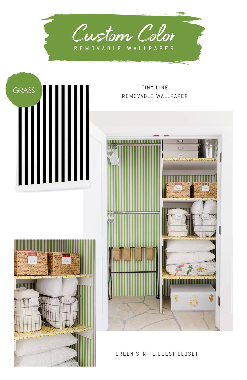
We offer two palettes - Elegant Neutrals and Bright and modern, with 58 different colors for you to pick out of. Most of the custom color requests are made within the two palettes. However if you feel that a tone is too brighter of just the opposite needs a little more accent, we can adjust that upon request as well. This particular closet project by Diana Elizabeth begun with yellow lemon shelf liners and she found our GRASS color to be the best match for the Tiny stripe removable wallpaper to make her guest closet fun and welcoming.

Your color
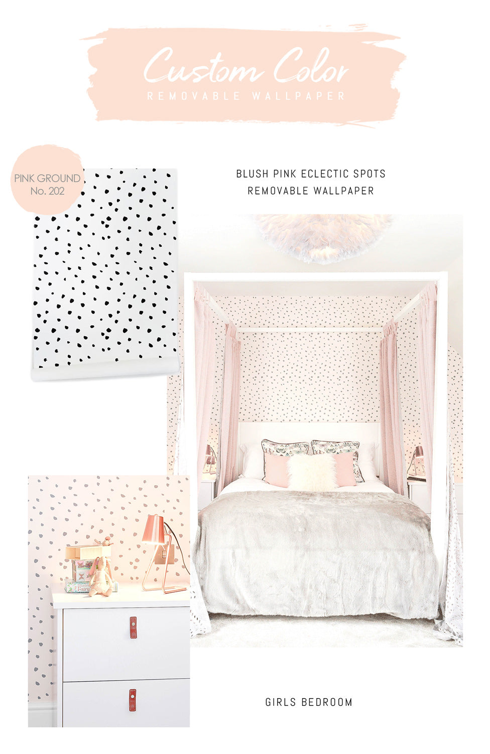
If you don’t find any color from our palettes that would work for your project or already have a specific tone in mind, we will gladly match that as well. Most popular options are Pantone color chart or paint seller color swatches that are mostly available online. Matching to certain paint was very successfully done in this girls bedroom by Cooper and Cooper design in London, UK. The background color of the Eclectic spots removable wallpaper was matched to Farrow and Ball paint color Pink Ground No. 202 and the spots where changed from black to a dark grey.

Other options
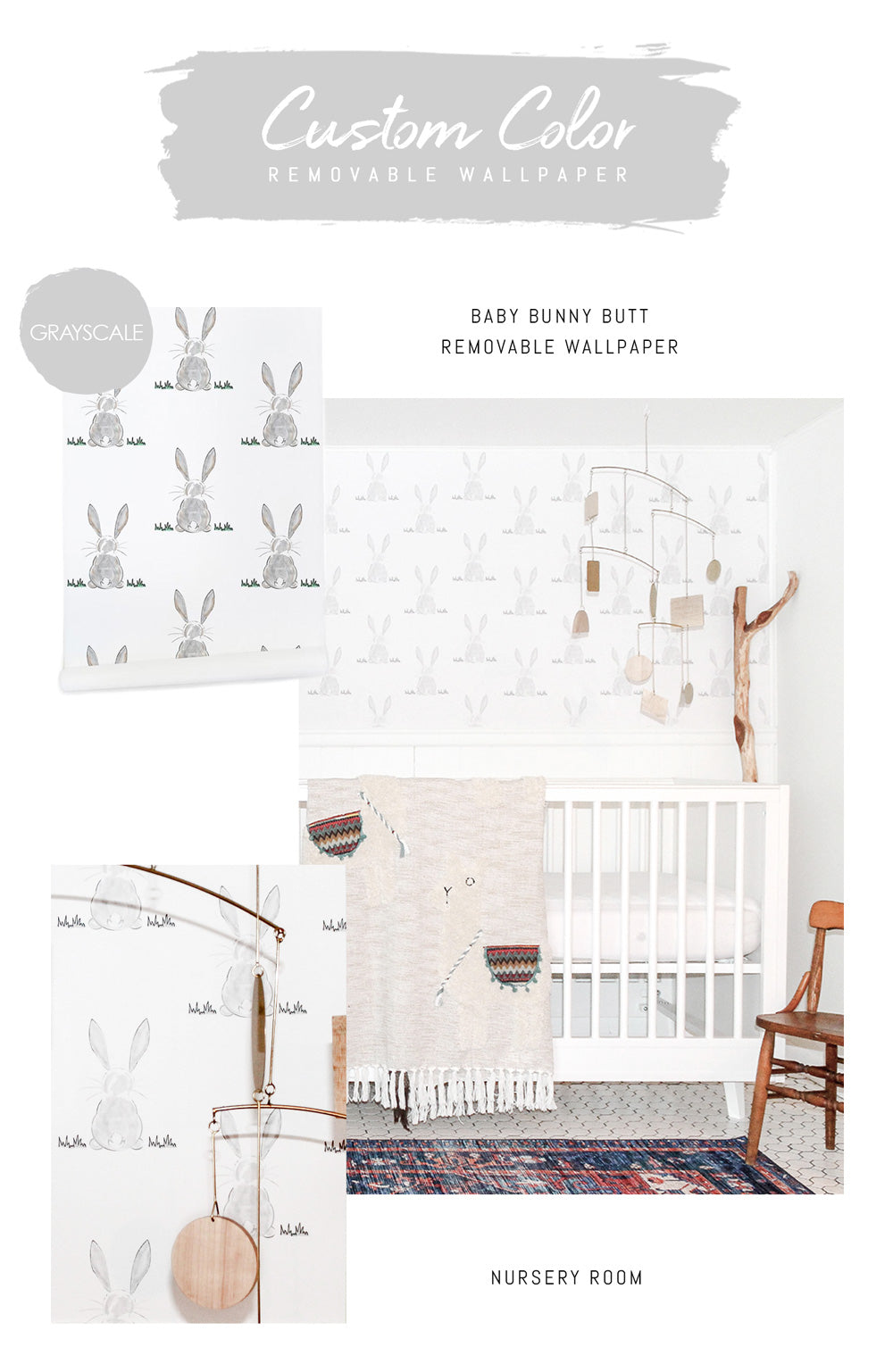
The options to find the right color for your project are almost endless. We can match the pattern color to a piece of furniture you have found for the space. You might have found painting that has a specific tone. However in case we match the color to an image of something, you have to keep in mind that the tone might differ slightly, as we see a digital image not the real life color. For this project, with one of our most popular kids wallpaper, Bunny butt design, Kari from Prospect & Kane made a request of having it in grayscale and it turned out just wonderful for her neutral nursery .

If you have been planning an exciting wallpaper project for your home and have something specific in mind, let us know all the details and we will gladly work with your ideas, providing digital samples and making your project come to life.


